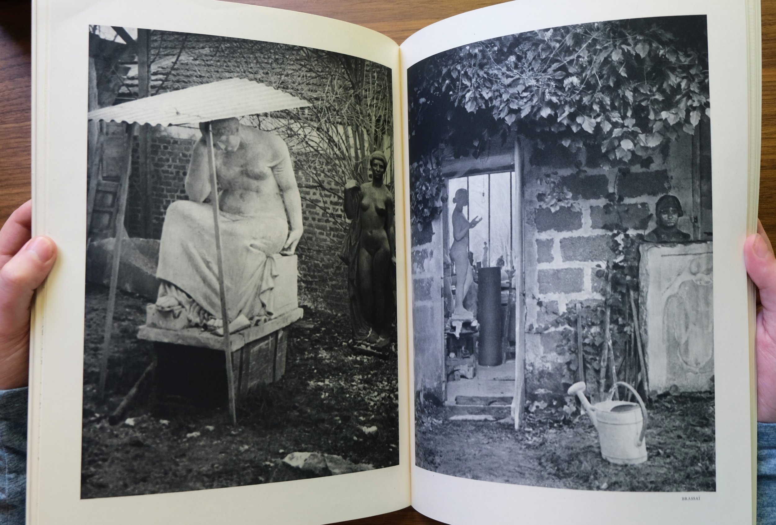
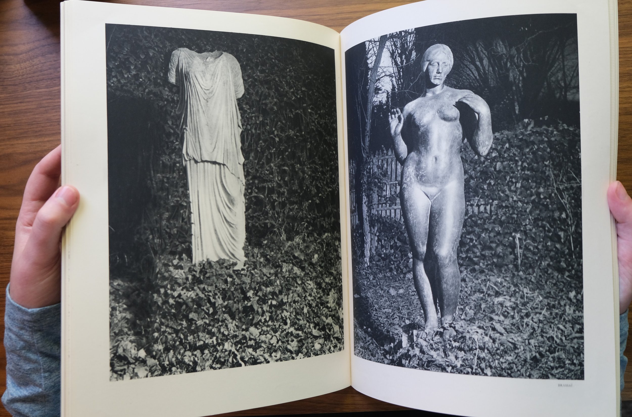
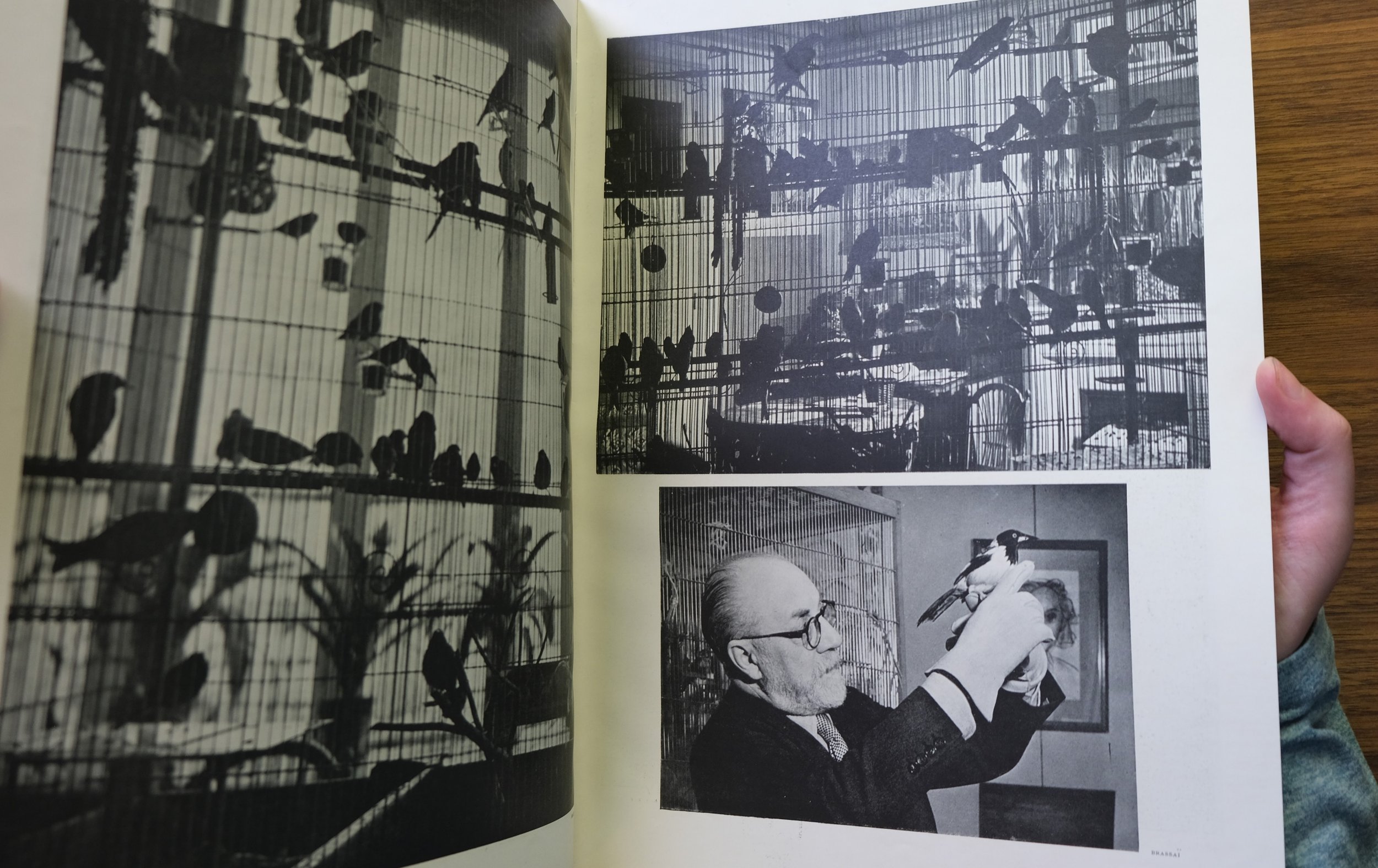
Verve, Tériade’s Legendarily Beautiful Art Magazine

Verve’s legendary run began in 1937 with a striking cover by Henri Matisse. The first issue contained Dora Maar’s famous photos of Guernica and notable essays from Andre Gide and Andre Malraux. From the outset, Verve’s editor, Efstratios Eleftheriades, who went by Tériade, set incredibly high standards for the publication. Originally, funded by David Smart, whose publication company owned Esquire, Tériade was charged with creating the most beautiful magazine in the world. To this end, he would spare no expense; no other publication has made such extensive use of expensive printing techniques. For each issue, Tériade commissioned numerous original color lithographs from the biggest artists of his day, as well as photogravure prints of B&W photos and detailed reproductions of artworks in color. Verve guided its readers through the studios and minds of artists from Pablo Picasso and Henri Matisse to Georges Rouault and Astride Maillol. In the same issue, one could find luscious color reproductions of Medieval manuscripts and modern lithographs by artists such as Andre Derain. Writing for the New York Times, John Russell stated that, “After World War II, and before the exhibition industry had got fully under way, virtually the only way to keep in close touch with what was being done by Matisse, Picasso, Braque and Chagall was to grab the relevant issue of Verve. What may look today like automatic choices had at that time a revelatory quality.” Verve’s publications have never been matched and were unprecedented events brought about by advances in printing technology, a special milieu which found Paris at the center of modern art, and the unique interests of its gifted editor, who had resolved to elevate his magazine to the pinnacle of graphic arts through close collaborations with the leading artists of his day.

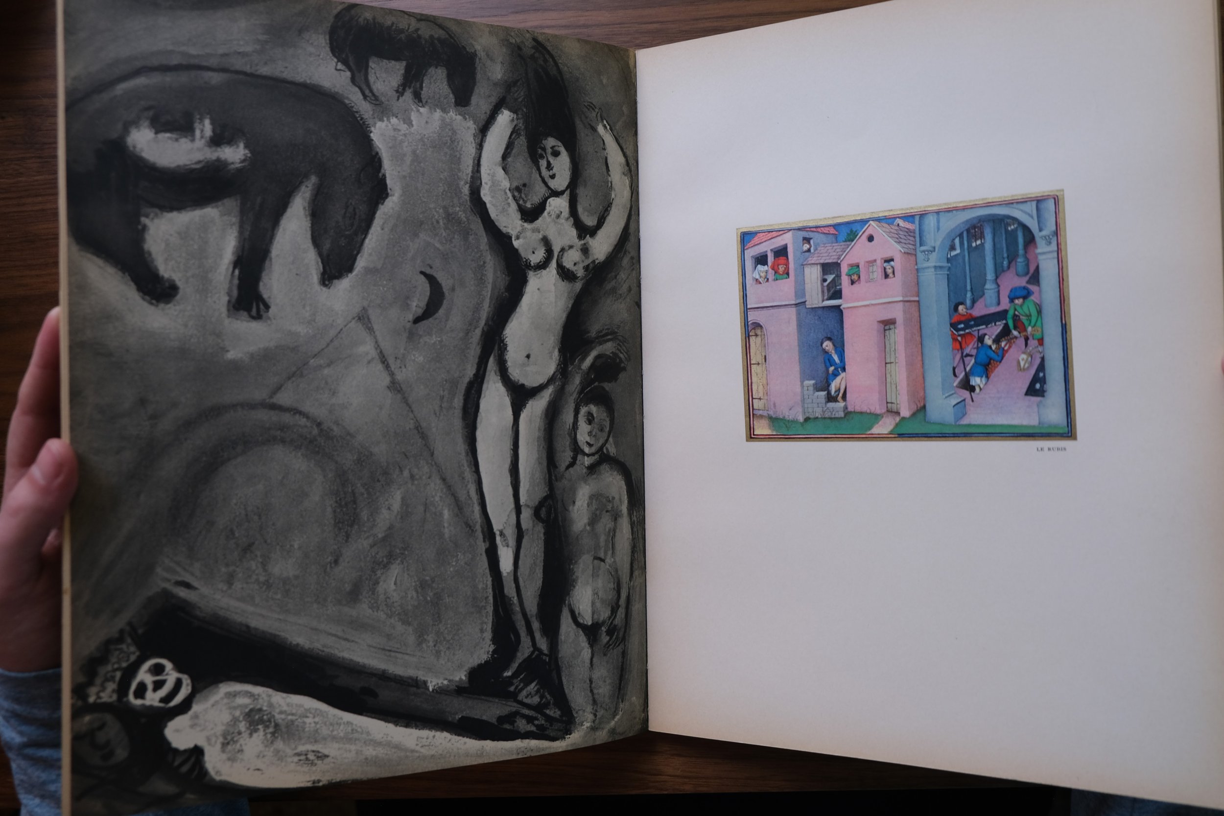
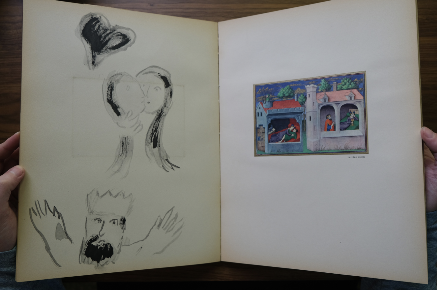
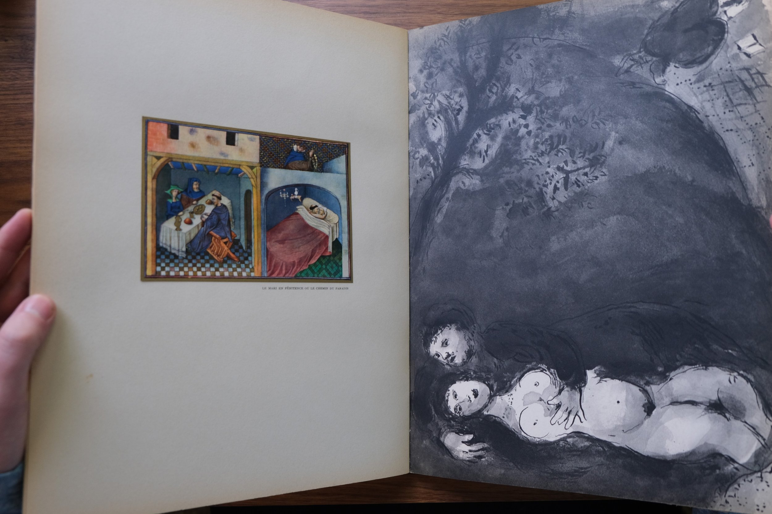
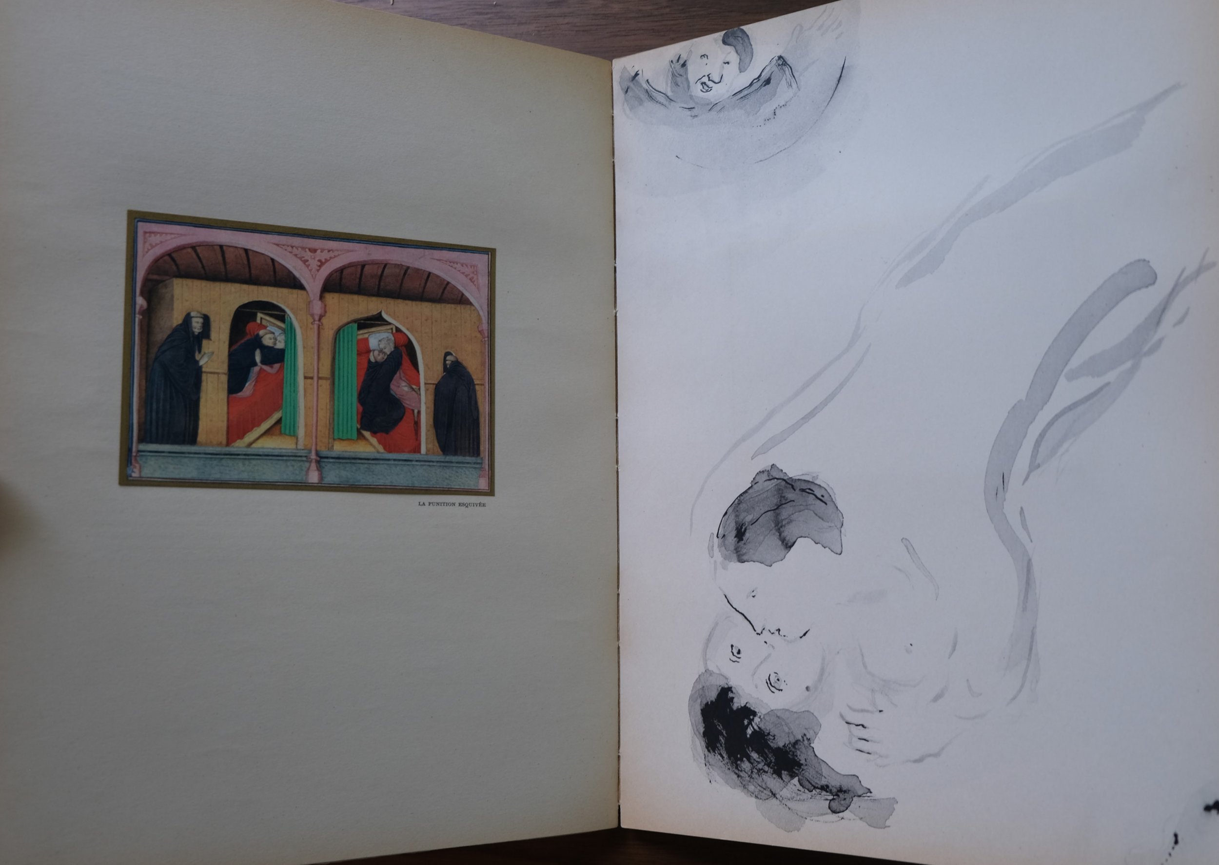
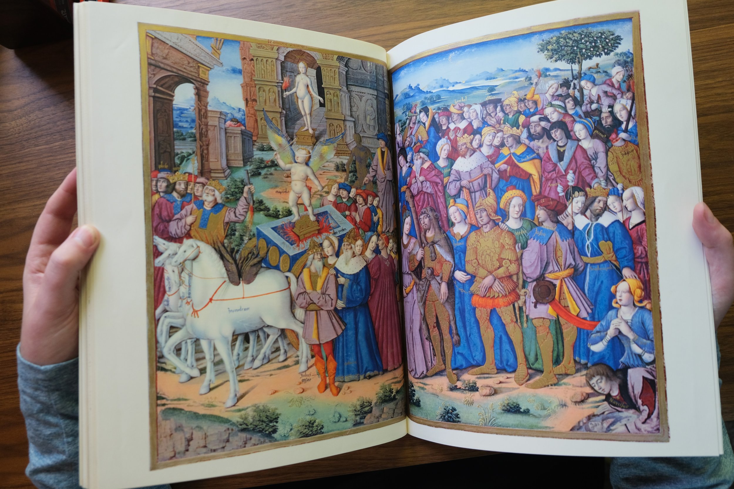
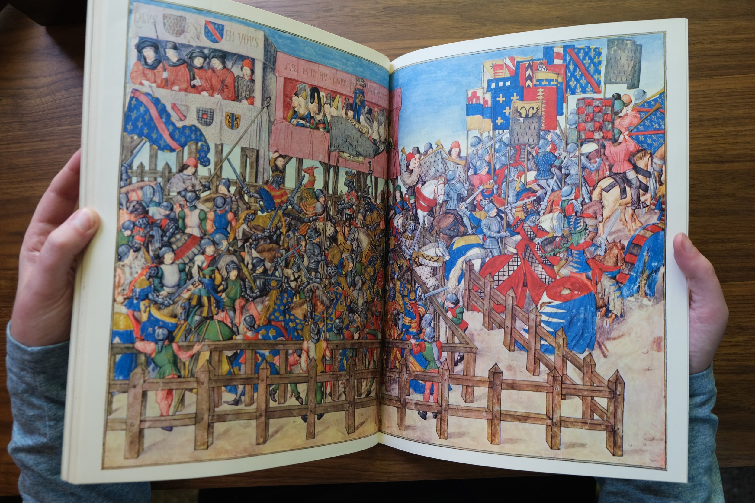
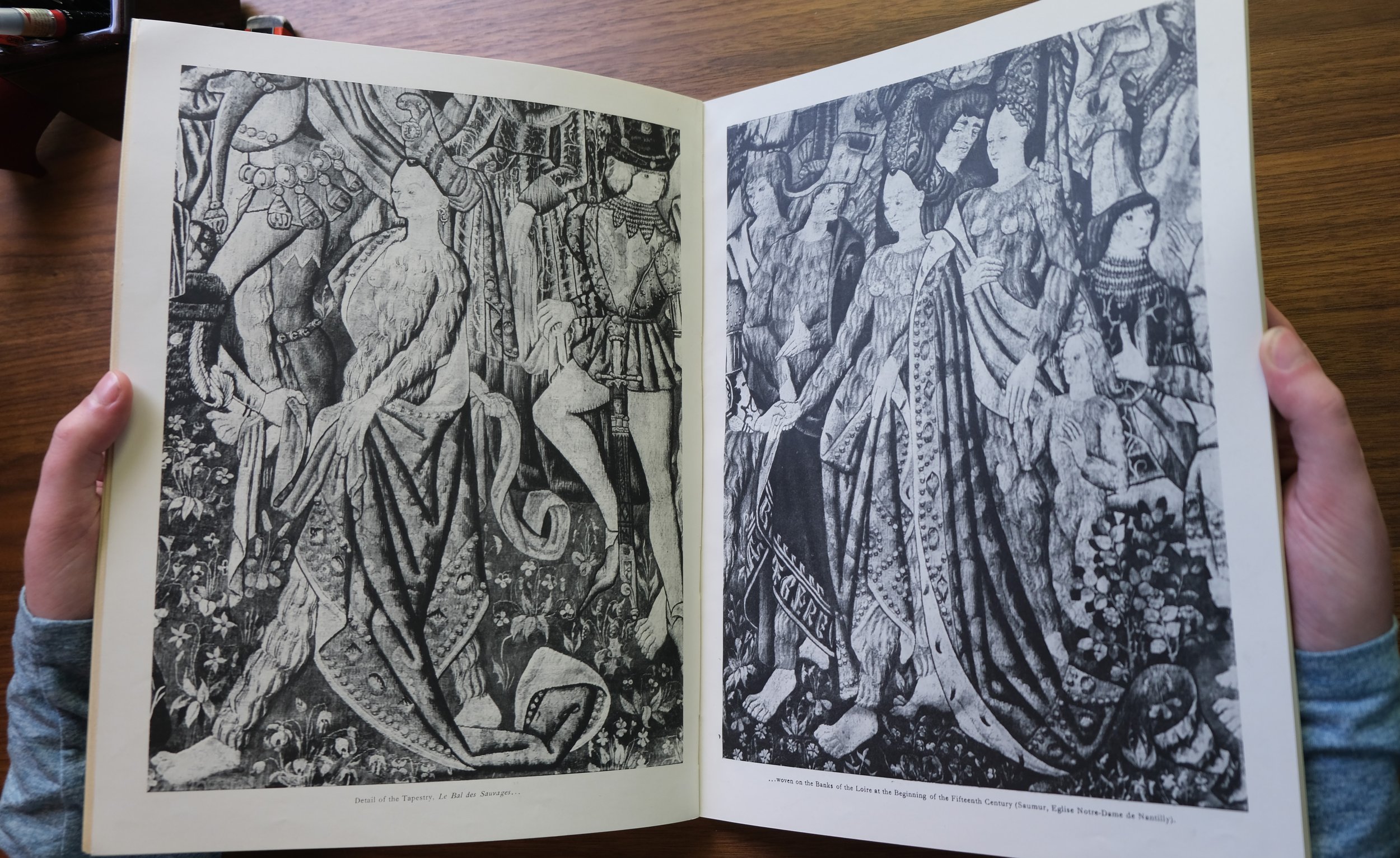
Tériade would intersperse pages from medieval illuminated manuscripts side by side with original lithographs by Andre Derain (see the #8 war issue), and the works of Marc Chagall were similarly juxtaposed in the Contes de Boccace issue (#24). Verve was a periodical in the sense that it was published at regular intervals, but each issue was uniquely surprising. Some issues were entirely dedicated to reproducing gorgeous medieval texts at the highest level, while others were entirely dedicated to the works of Picasso’s caricatures.
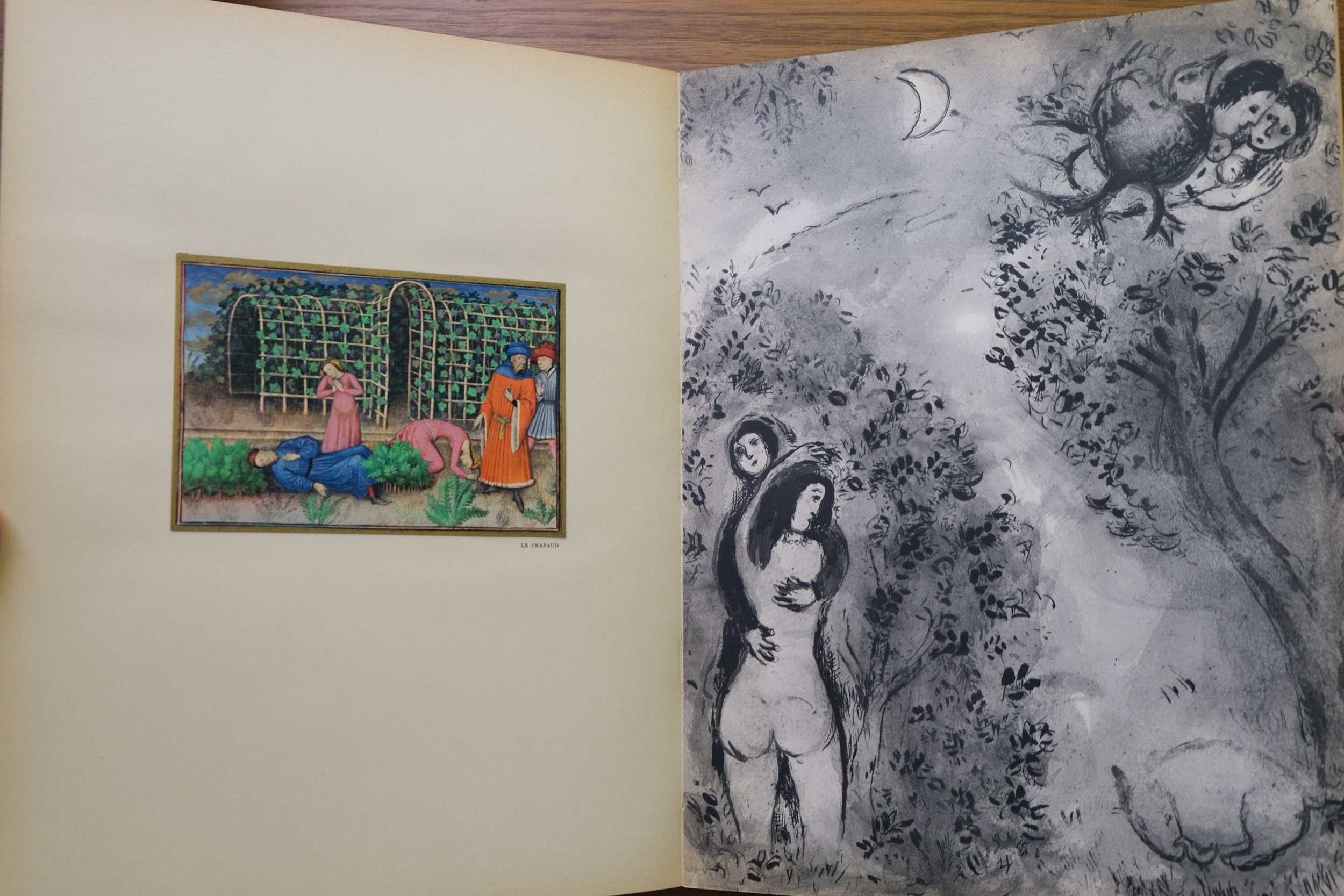
According to John Russell, “Never a natural subordinate, Tériade tailored Verve to suit his own image, which was that of a portly, benign, amused and amusing man who had been in and out of the Parisian art world for many years and is not known to have made an enemy. Unlike some of his former associates (on Minotaure, especially), he never showed his sharp teeth (and was widely believed not to have any). What he wanted was for the artists he liked best to realize themselves completely in Verve. He also wanted Verve to be as rewarding to read as to look at.” Tériade truly viewed the artists that he worked with as creative partners. While each issue bore the unmistakable elegance of his editorial influence, their inner variety testified to the incredible influence that individual artists had within this publication. Tériade was dedicated to honesty reflecting the work of his collaborators and his unimpeachable reputation was a result of this commitment. He was truly a friend and benefactor of the arts and Verve was like a beautiful garden that he created to share the beauty that he discovered with this world. Within this garden of images and ideas, centuries pass between pages and generic boundaries disappear, yet there is always a sense of reverence for the power of images and ideas as a beacon of shared humanity across time and place.
Verve was published on the best papers, made by Arches, an illustrious paper mill that began production in 1492 and whose papers still represent the most desirable option for watercolorists, printmakers, and luxury bookmakers. Tériade would always go the extra mile to ensure that the most suitable line of paper was being used for each print. Tériade worked with the leading printmakers of his day, Draeger Freres for photogravure and Fernand Mourlot for lithography. Mourlot had experience making deluxe color art posters, and Tériade would ensure that each issue of Verve featured a lithograph by a leading artist on its cover. From the moment his readers picked up their issue, Tériade made sure that they knew they were holding something special. It was in this sense that Tériade really set himself apart from other notable French art magazines at the time. Cahiers d’ Art, XXe Siecle, and Minotaure are all highly collectible magazines that featured works of leading artists. Before starting Verve, Tériade worked with Christian Zervos at Cahiers d’ Art, managing the Modernist section. Tériade was also involved with the surrealist journal, Minotaure, which was primarily a vehicle for Andre Breton. When Tériade founded Verve, however, he was not creating a bulletin for an artistic movement or trying to be the leading source of news from the French art world (he left the former mission to Breton, and the latter to Zervos). Nor was Tériade the only publisher known for including original lithographs and prints in his magazine (XXe Siecle was another such magazine), but Tériade’s work eclipsed that of his rivals due to his refusal to compromise on quality and because Verve was always meant to be more than a magazine; from the beginning, it was a work of art in its own right.

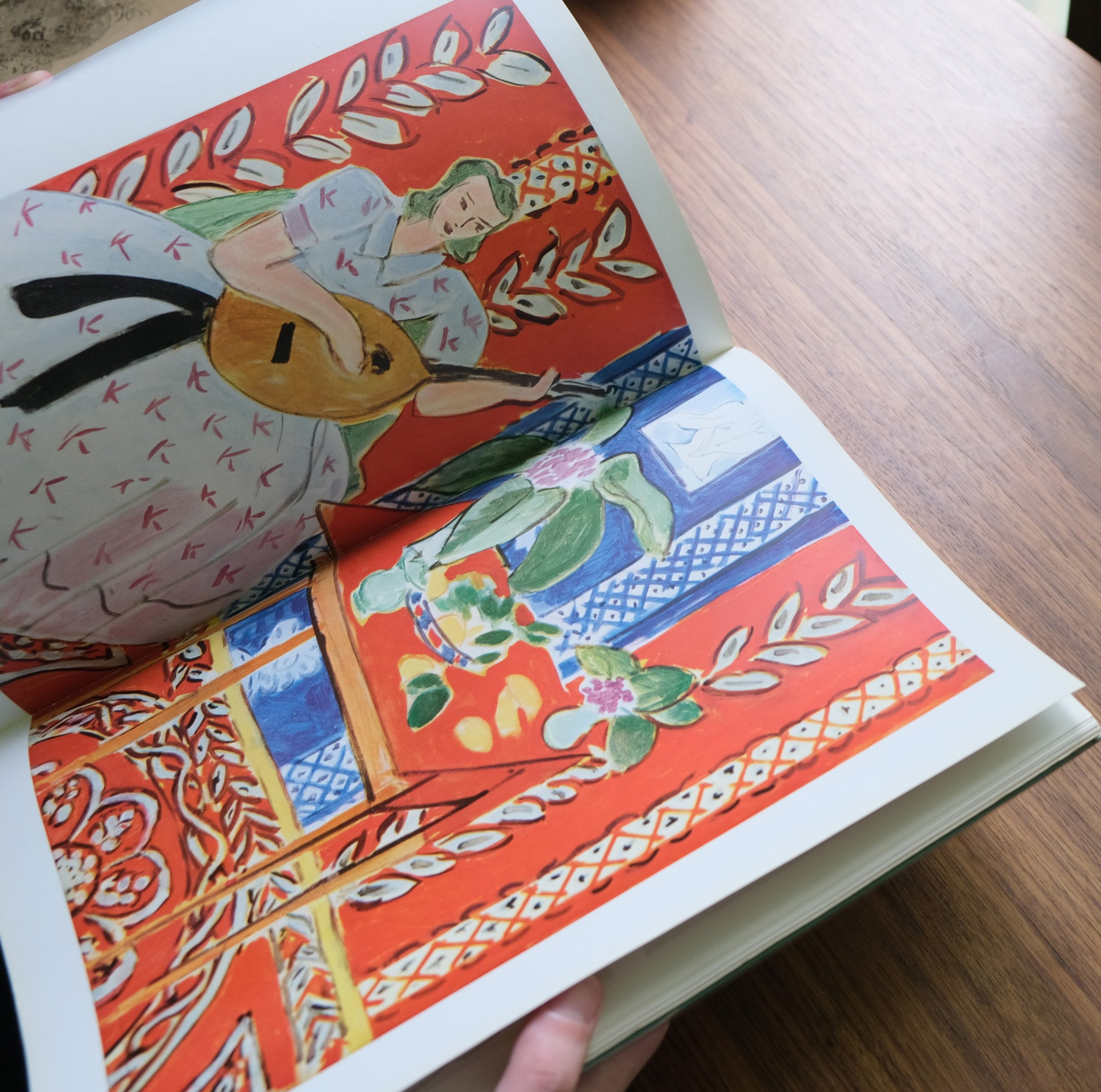
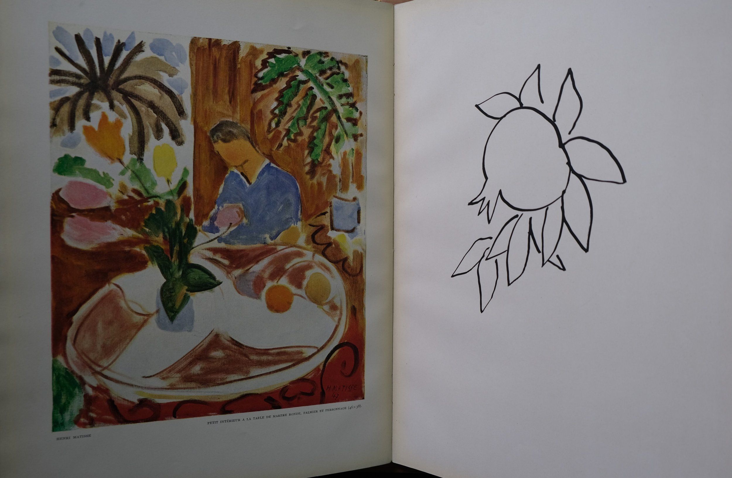
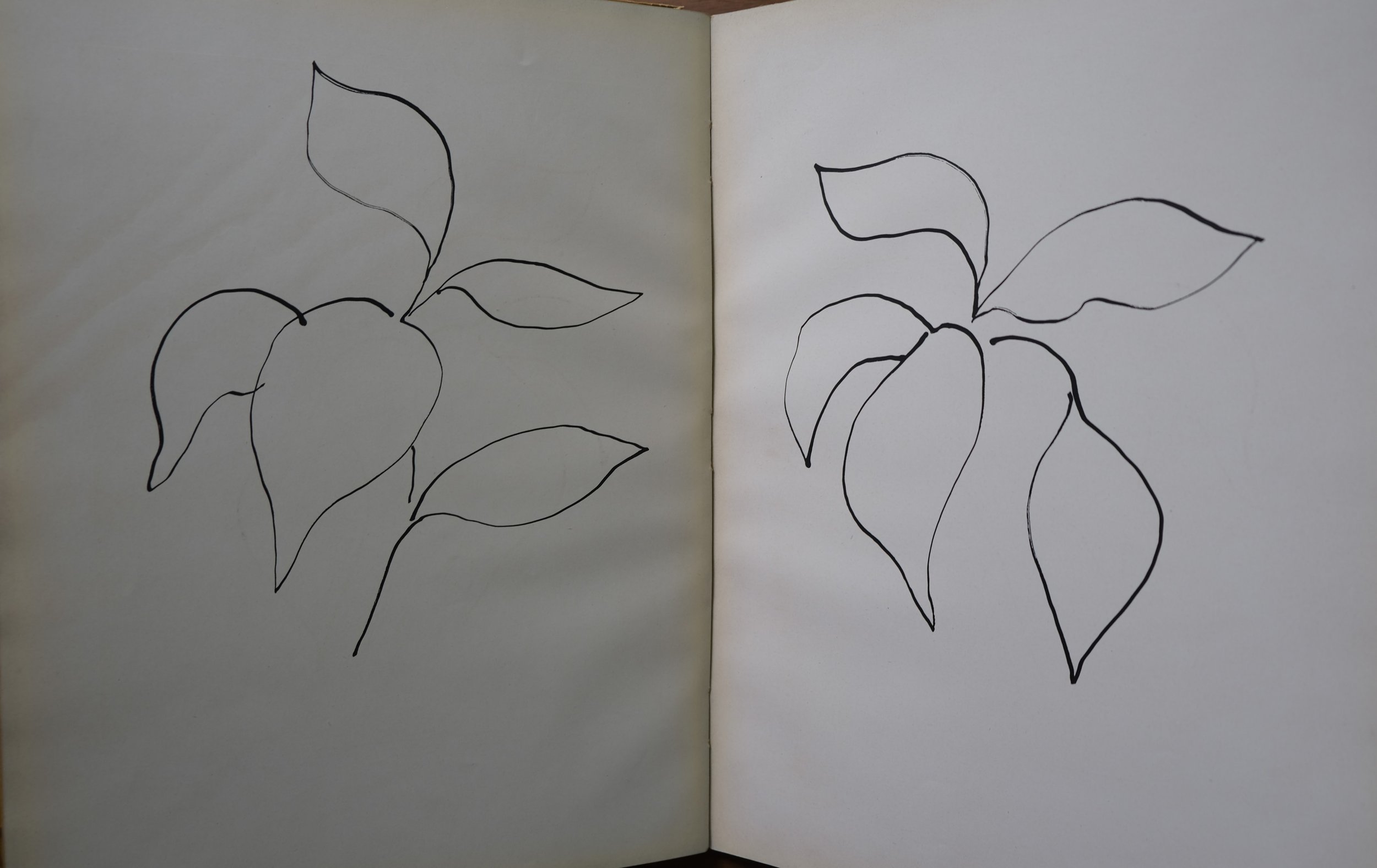
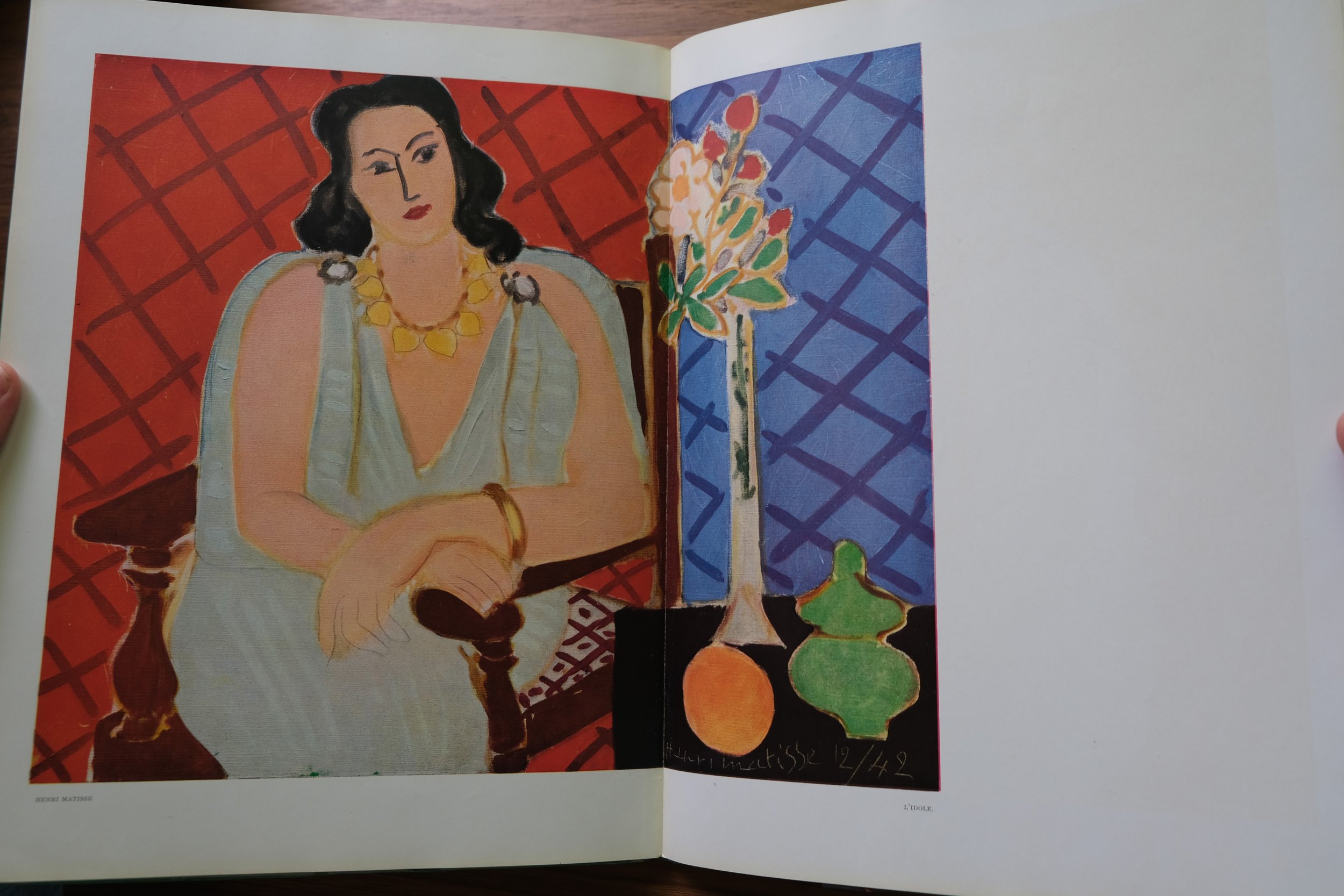
Tériade’s collaborations with Henri Matisse were particularly illustrative of his special talents as an editor. Matisse was a very exacting artist who insisted on extremely high standards of reproduction for his work. Matisse became intimately involved in the printing process and his notes were taken very seriously by Tériade, who went so far as to publish them alongside the prints in Verve #13, Henri Matisse, De la Couleur, which was dedicated entirely to work that Matisse produced between 1940 to 1944. Matisse’s famous paper cut-outs emerged in large part out of this process. Dissatisfied with the initial color reproductions of his paintings, Matisse came upon an interesting solution to achieving desired color reproductions by cutting maquettes directly out of the printer’s color sheets. These graphic works could then be printed in the exact colors with which they had been conceived.
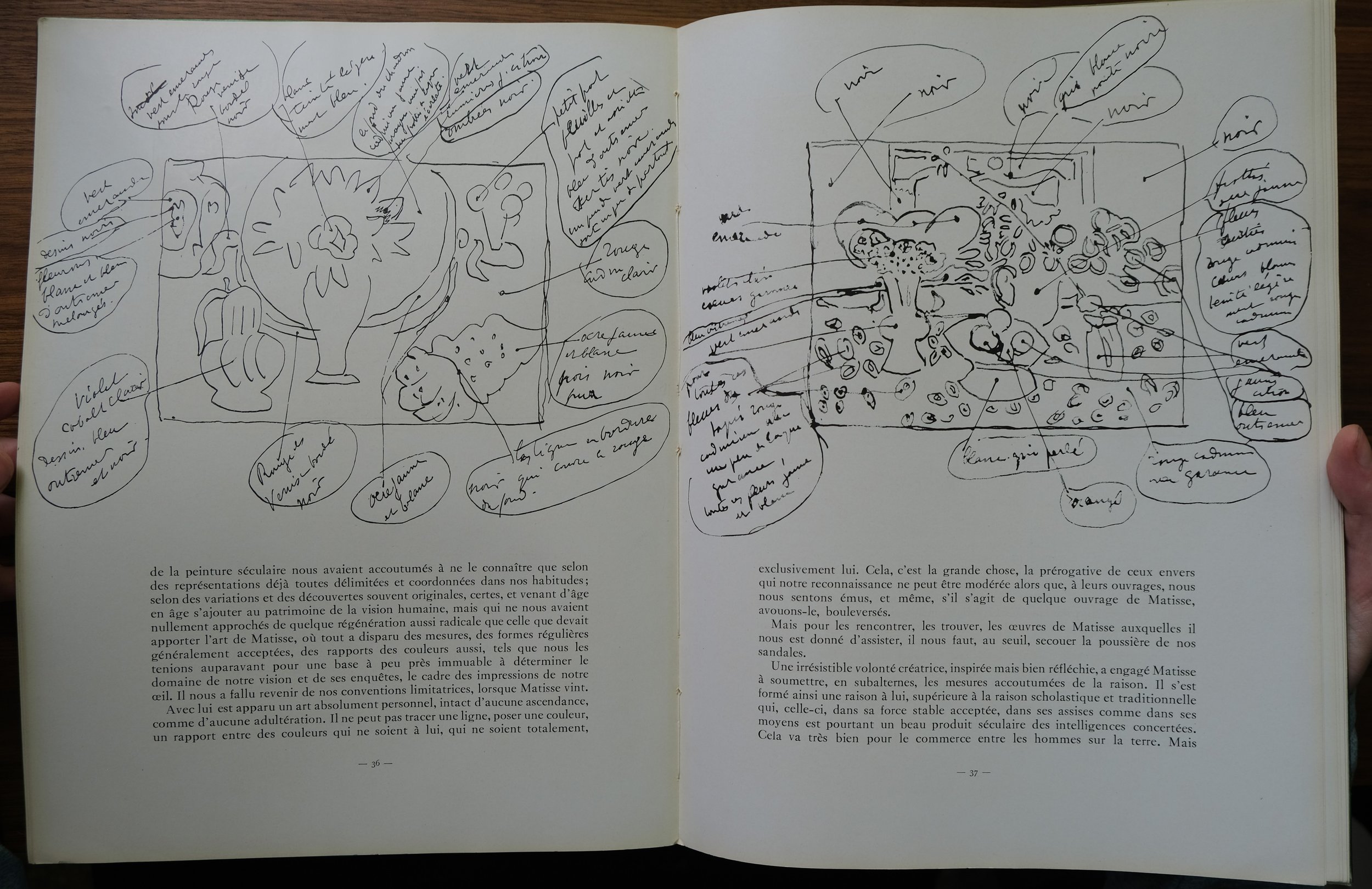
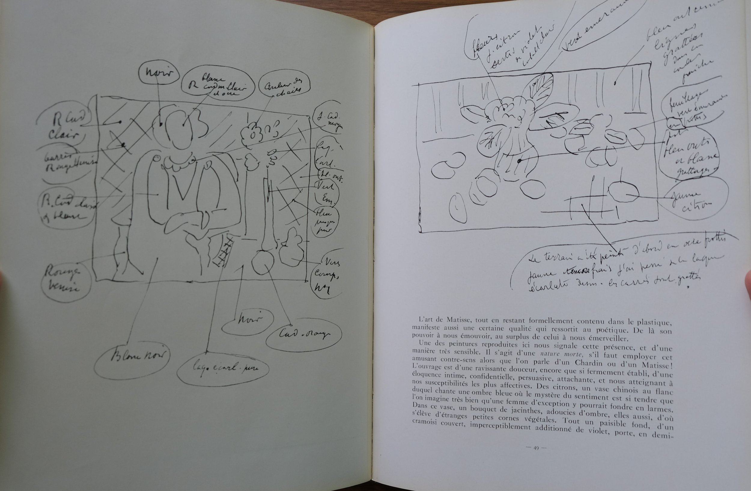
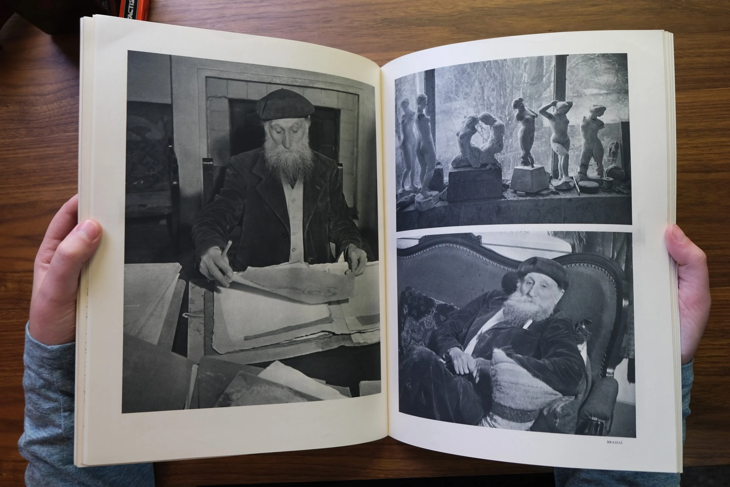
Matisse’s paper-cut process would eventually lead to the groundbreaking publication Jazz (published by Tériade in 1947), as well as the most beautiful edition of Verve, Matisse’s posthumous special issue (#35-6, published in July 1958) devoted entirely to color cut-outs. This legendary issue was comprised entirely of color lithographs and is the most prized Verve issue (followed by the final issue, dedicated to Chagall’s Bible illustrations). These issues are particularly hard to find because they are often broken down and sold as individual prints by online art dealers looking to increase their profit (and this is true of Verve, in general). As it happens, this is how I first discovered Verve. An online auction had many lithographs from the Matisse special issue and I was bidding on Matisse’s famous lithograph of a snail composed of paper cut-outs. I also purchased several larger prints that came as fold-outs. I noticed that they were all attributed to Verve and had titles on the versos. My curiosity was quickly awakened. I began to buy all of the books that I could find about Verve and Tériade, and then I began to search for the original issues. It was an online adventure that found me using Google Translate to negotiate with French and Italian rare booksellers, while constantly scanning AbeBooks for issues that I was still missing. For all that I could write about this amazing publication, nothing compares to holding an issue in your hands and slowly paging through it for yourself. This experience changed my whole notion of what a book could be.

Those who are interested in learning more about Verve would do well to purchase the book Verve: The Ultimate Review of Art and Literature (1937-1960), published by Harry Abrams in 1988. This large format book (which is now out of print) includes beautiful color images of each Verve cover and full-page color reproductions of notable images from each issue, as well as samples of the notable texts featured in each issue. Each issue of Verve is put into context and summarized at the beginning of each chapter. One might also check whether nearby universities or museums have accessible copies of Verve in their Special Collections. For those interested in purchasing copies for themselves, I recommend searching on AbeBooks.com, which is generally the best resource for finding rare and out-of-print books. I also recommend looking into the facsimile of Jazz published by Thames & Hudson, which can be found on Amazon.
***No sponsorship of any kind was included in this article. Every website recommendations are James’ real and honest recommendations. All the photos used for this article are properties of Advanced Leisure LLC & the Verve magazines used for the photos are also properties of Advanced Leisure LLC.
Works Referenced
Anthonioz, Michel, editor. Verve: The Ultimate Review of Art and Literature (1937-1960). H.N. Abrams, 1988.
Di Crescenzo, Casimiro, et al. Matisse and Teriade: Collaborative Works by the Artist and Art Publisher from Verve (1937-1960) ; Lettres Portugaises, 1946. Yoshii Gallery, 1997.
Russell, John. “ART VIEW; Flair for the Grand Gesture: Celebrating a Magazine.” The New York Times October 9, 1988, sec. Arts. https://www.nytimes.com/1988/10/09/arts/art-view-flair-for-the-grand-gesture-celebrating-a-magazine.html